Did you know that 75% of users judge a company’s credibility based on its website design? In today’s competitive digital landscape, your website is often the first impression potential customers have of your brand. Common design mistakes—like confusing navigation, slow load times, and poor accessibility—can frustrate visitors and drive them away before they even see your offerings.
Ensuring a seamless, user-friendly experience is key to converting visitors into loyal customers. If you’re ready to elevate your site, explore our web design services for small business to create a professional, engaging experience that aligns with your brand’s goals.
1. Confusing or Cluttered Navigation: Why Clear Navigation Matters
Website navigation is like a map for users, guiding them to key areas of your site. If your navigation is cluttered or unclear, users may struggle to find what they need, leading to frustration and higher bounce rates. Intuitive navigation keeps users engaged by making it easy to locate information quickly and efficiently.
The Importance of a Clear Navigation Structure
When visitors land on your site, they should instantly understand where to go to find what they’re looking for. An organized navigation structure that follows a logical flow helps them access information without confusion. Elements like a responsive navigation bar and clear labels make a significant difference in how users experience your site.
What to Avoid: Disorganized navigation levels with too many categories or pages can overwhelm users, making it challenging to navigate effectively. Avoid vague or generic labels and aim for clarity and precision instead.
How to Do It: Create a navigation hierarchy with primary categories at the top level, followed by subcategories. Use clear, descriptive labels for each section to avoid ambiguity, helping users understand where each link will take them.
Ensuring Broken Links Don’t Disrupt User Flow
Broken links can be a major frustration for users, disrupting their flow and making your site appear poorly maintained. Broken links lead to dead ends, which can quickly cause users to leave your site in search of more reliable options.
How to Fix It: Regularly test your navigation links and update any broken links. Use tools like Google Search Console or Dead Link Checker to identify and fix broken links, ensuring a smooth journey for users throughout your site.
Creating an Intuitive Navigation Experience
Intuitive navigation feels effortless, guiding users from one section to the next naturally. Visitors should feel that your navigation bar knows what they’re looking for, with essential pages prominently placed and easily accessible.
How to Do It: Use a sticky navigation bar that remains visible as users scroll. Position key pages like “Home,” “About,” and “Contact” at the top level, so users can access them without backtracking.
Building a Navigation Hierarchy for User-Friendly Access
A well-organized navigation hierarchy allows users to understand your site’s structure at a glance. Grouping related content together in an accessible format makes it easier for visitors to follow a logical path.
Why It Matters: A consistent hierarchy helps users feel grounded on your site. For example, place product or service categories at the top level, with specific subcategories beneath them, creating a straightforward, tiered structure that users can quickly understand.
How to Do It: Begin with a sitemap to plan your site’s structure. Arrange pages by relevance, grouping similar content together to build a clear navigation hierarchy that’s both simple and effective.
Labeling for Clarity and Precision
Labels in your navigation should give visitors an immediate understanding of what they’ll find on each page. Vague or inconsistent labels can confuse users and make it hard to locate specific content.
What to Do: Choose labels that are straightforward and descriptive, like “Pricing” instead of “Plans” or “Contact Us” instead of “Reach Out.” These labels guide users intuitively, helping them find what they need without unnecessary guesswork.
Responsive Navigation Bar for a Seamless Mobile Experience
With so many users browsing on mobile devices, a responsive navigation bar is essential. Your navigation should adapt seamlessly to smaller screens, ensuring an optimal experience no matter how visitors access your site.
How to Do It: Use a collapsible or hamburger-style menu for mobile devices to keep navigation streamlined. Test your responsive navigation across different devices to confirm that menus display properly and links are easy to tap.
Using a Sitemap to Plan and Optimize Navigation
A sitemap is a valuable tool for organizing your website’s content structure, allowing you to plan the layout and optimize the navigation flow. By mapping out your pages, you can see how each one connects and avoid redundancy.
How to Do It: Use your sitemap as a blueprint to design the navigation hierarchy. This can prevent overcrowding your main navigation with excessive links and helps you arrange related pages together for a more cohesive layout.

2. Ignoring Accessibility Needs: Why Accessibility is Essential
Accessibility is crucial for ensuring that all users, including those with disabilities, can fully engage with your website. Beyond improving user experience, accessibility also helps meet legal standards like the ADA and WCAG. Neglecting accessibility can lead to a frustrating experience for some users and possible compliance issues.
Accessible Names, Labels, and Alternative Text
Accessible names, labels, and alt text make your site understandable for users who rely on assistive technologies such as screen readers. These elements allow users with visual impairments to engage with images, buttons, and forms on your site.
How to Do It: Use descriptive names and labels on interactive elements, like buttons or forms, and add concise alt text to images that explains their purpose. This improves perceivability and ensures all users understand the content.
Color Contrast and Visual Focus Indicators
High color contrast and clear visual focus indicators are essential for users with visual impairments. These elements enhance perceivability by making it easier for users to locate and read content across your site.
How to Do It: Choose contrasting colors for text and background, and use focus indicators, like highlighted outlines, to show where users are on the page—especially helpful for keyboard navigation.
Keyboard Accessibility and Navigation
Keyboard accessibility is vital for users who cannot use a mouse. Ensuring your site is operable by keyboard alone makes it usable for a broader audience and is a key element of operability.
How to Do It: Test your site to ensure all interactive elements, such as links, buttons, and menus, can be accessed with the Tab key. This improves navigability and usability for all users.
3. Forgetting Mobile Users: Why Responsive Design is Essential
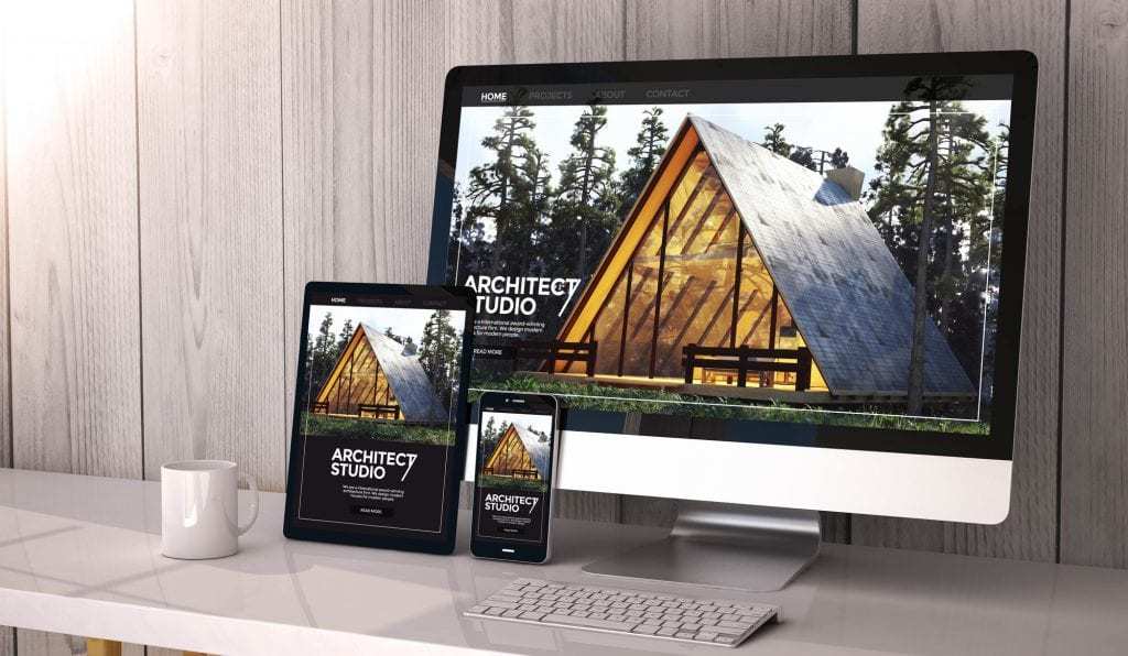
With more than half of all web traffic coming from mobile devices, responsive design is crucial. A responsive site adapts seamlessly to any screen size, ensuring a smooth user experience across desktops, tablets, and smartphones. Beyond usability, Google prioritizes mobile-friendly sites, so failing to optimize for mobile can hurt your search rankings and reduce visibility.
Mobile Queries and Media Queries for Flexible Layouts
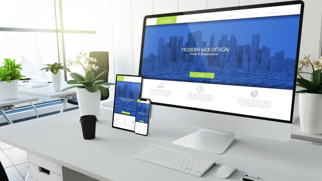
A truly responsive site relies on mobile queries and media queries to detect screen size and adjust content accordingly. This adaptability ensures that your website looks and functions well on any device, whether it’s a desktop monitor or a smartphone.
How to Do It: Implement media queries in your CSS to define how your site should respond to various screen sizes. This approach allows your layout, images, and text to resize smoothly on different devices, providing an optimized experience for each.
Mobile-First Strategy for Seamless User Experience
A mobile-first strategy involves designing for smaller screens first, then scaling up for larger devices. This approach ensures that your site is optimized for the mobile experience, which is often more challenging due to limited space and touch-based interactions.
Why It Matters: Starting with mobile design ensures that essential features are prioritized, making the mobile experience intuitive and user-friendly. A mobile-first strategy leads to a site that’s functional and appealing on all devices.
How to Do It: Design your layout, navigation, and content with mobile users in mind, then expand your design for larger screens. This makes it easier to ensure a consistent experience across all devices.
Optimizing Navigation Layout with a Hamburger Menu
On smaller screens, space is limited, so a hamburger menu is a popular solution for keeping navigation organized and accessible. This collapsible menu saves space while still allowing users to access all key pages.
How to Do It: Use a hamburger menu for your primary navigation on mobile. This keeps the design clean and gives users quick access to essential links without overwhelming the screen.
Testing with Google’s Mobile-Friendly Test and LT Browser 2.0
Testing your site’s mobile performance is crucial to ensure it’s responsive and user-friendly. Google’s Mobile-Friendly Test checks if your site meets Google’s mobile standards, while LT Browser 2.0 allows you to preview and troubleshoot your site on various screen sizes and device types.
How to Do It: Start with Google’s Mobile-Friendly Test to identify areas needing improvement. Use LT Browser 2.0 to view your site on different devices, allowing you to test responsiveness across popular mobile models and screen sizes.
Adjusting Text Formatting for Readability
On smaller screens, text formatting plays a vital role in readability. Content that looks fine on desktop may appear cluttered or hard to read on mobile, so adjustments in font size, line spacing, and paragraph breaks are essential.
How to Do It: Use larger font sizes and generous line spacing for mobile devices. Break up long paragraphs and add whitespace around text to make content easier to read and prevent crowding on small screens.
4. Skipping Clear Calls-to-Action (CTAs): How Effective CTAs Boost Conversions
A well-placed call to action (CTA) is a critical element in guiding users toward desired actions, whether that’s a purchase, a subscription, or a contact form submission. Without clear, effective CTAs, visitors might not know the next step, resulting in missed conversion opportunities.
Using Actionable Language for Direct Engagement
Actionable language in CTAs is essential for prompting users to take specific steps. Words like “Join Now,” “Start Your Free Trial,” or “Download the Guide” give users a clear direction and inspire immediate action.
How to Do It: Use direct, action-focused phrases that communicate exactly what users should expect. Instead of vague language like “Learn More,” specify the benefit, such as “Get My Free Guide.”
Highlighting Benefits to Make CTAs Enticing
Effective CTAs often emphasize benefits that appeal to the user’s needs or interests. By showcasing what users gain, such as saving time, getting exclusive access, or improving results, CTAs become more enticing and increase the likelihood of conversion.
How to Do It: Incorporate phrases that highlight benefits, like “Boost Your Reach” or “Save 20% Today.” This adds value to the CTA and makes the action more appealing to users.
Creating Clear Calls-to-Action to Reduce Missed Opportunities
A clear call to action reduces confusion and missed opportunities by giving users an obvious path forward. When CTAs blend into the page or are hard to locate, users may leave without engaging.
What to Avoid: Avoid vague language or hidden CTAs that blend in with other elements. This can make it difficult for users to find or understand the next steps, resulting in lost engagement.
How to Do It: Make CTAs prominent with contrasting colors, larger fonts, and clear placement in high-traffic areas. For example, place CTAs at the top of the page or at logical conversion points in the user journey.
Incorporating Personalized CTAs for Targeted Engagement
Personalized CTAs add a tailored touch that can increase engagement by resonating with specific user interests or behaviors. When users feel that the CTA is relevant to their needs, they’re more likely to act.
How to Do It: Use dynamic CTAs that adapt based on the user’s location, browsing history, or purchase behavior. For instance, a returning visitor might see “Continue Your Journey” rather than “Learn More.”
Prompting Specific Actions with Clear and Specific CTAs
A specific action CTA eliminates guesswork and directs users to what’s next. CTAs like “Book a Consultation” or “Watch Our Demo” clarify exactly what users are committing to, enhancing clarity and driving higher engagement.
How to Do It: Choose precise language that sets clear expectations, leading users to an immediate action. This approach minimizes hesitation by making the desired outcome clear and straightforward.
5. Using an Unappealing or Inconsistent Color Scheme: Why Color Matters
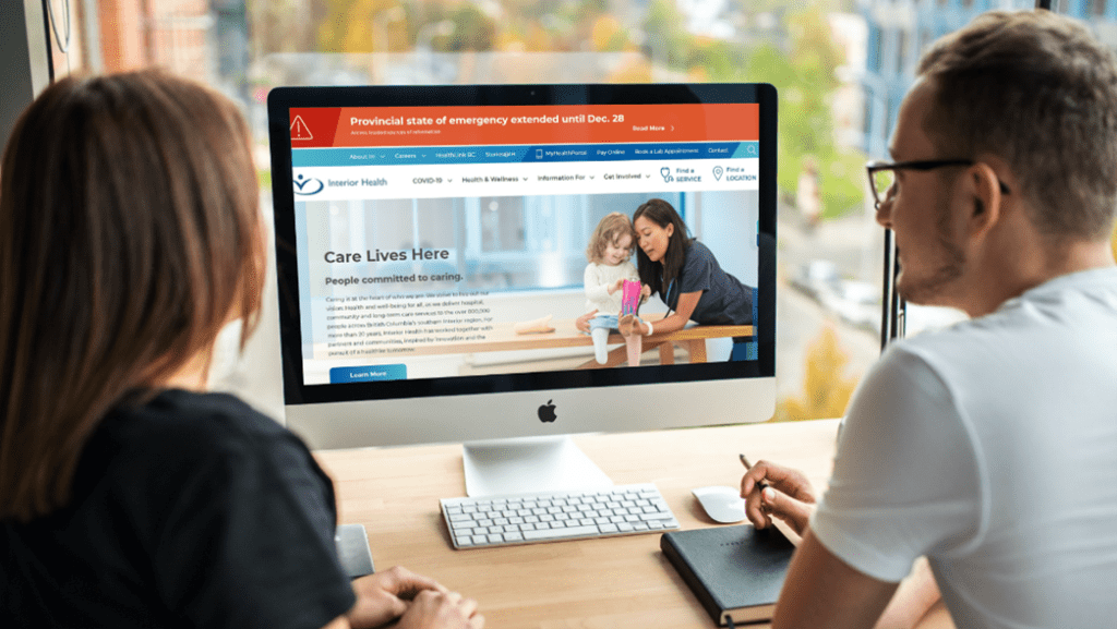
The right color scheme can strengthen your brand identity and enhance the user experience, while poor color choices can detract from both. Colors influence a user’s perception of your brand, creating an emotional response that can either engage visitors or push them away. Selecting a color palette that aligns with your brand and maintains visual appeal is essential for building trust and consistency.
Establishing a Main Color for Brand Recognition
A strong main color helps users instantly recognize your brand and creates a cohesive look across your site. This primary color should represent your brand’s personality and be featured prominently throughout the website.
How to Do It: Select a main color that resonates with your brand values. Use this color in key elements like headers, buttons, and logos to reinforce brand identity and create visual consistency.
Choosing Complementary and Contrasting Hues for Balance
Combining complementary hues and contrasting hues in your color scheme helps maintain visual interest without overwhelming users. Contrasting hues improve readability, while complementary hues add depth and harmony to the design.
How to Do It: Use a 60-30-10 rule: 60% main color, 30% complementary color, and 10% accent color. This approach creates a balanced layout that’s easy to read and visually appealing.
Enhancing Visual Appeal with Accent Colors
Accent colors are used sparingly to draw attention to specific elements like CTAs, links, or highlighted content. When chosen well, accent colors can guide users’ eyes naturally across the page, enhancing navigation and interaction.
How to Do It: Choose one or two accent colors that work with your main and complementary hues. Apply these colors to buttons, icons, or other key elements that need to stand out, without overwhelming the overall design.
Avoiding Poor Color Palettes and Overuse of Colors
Using too many colors or a poor color palette can make your website look chaotic and unprofessional. A limited color palette keeps your site visually coherent and helps users focus on your content rather than getting distracted by competing colors.
What to Avoid: Avoid using more than three main colors, and steer clear of overly bright or clashing tones. A cluttered palette can detract from your content and create a disjointed experience for users.
How to Do It: Limit your palette to three main colors—primary, secondary, and accent—and ensure they work together. Tools like Coolors or Adobe Color can help you create harmonious color schemes tailored to your brand.
Recognizing the Influence of Color on Brand Identity
Colors communicate your brand’s essence. A well-chosen color scheme reflects your brand’s values and can evoke the desired emotional response in your audience. Bold colors might convey confidence, while softer hues might create a sense of calm and trust.
Why It Matters: The colors you choose are part of your brand’s story, so they should align with the message you want to communicate. A cohesive, well-thought-out color scheme fosters recognition and strengthens your brand image.
Mind Your Business Newsletter
Business news shouldn’t put you to sleep. Each week, we deliver the stories you actually need to know—served with a fresh, lively twist that keeps you on your toes. Stay informed, stay relevant, and see how industry insights can propel your bottom line.
Subscribe to Mind Your Business
6. Overloading Pages with Content: Why Content Hierarchy Matters
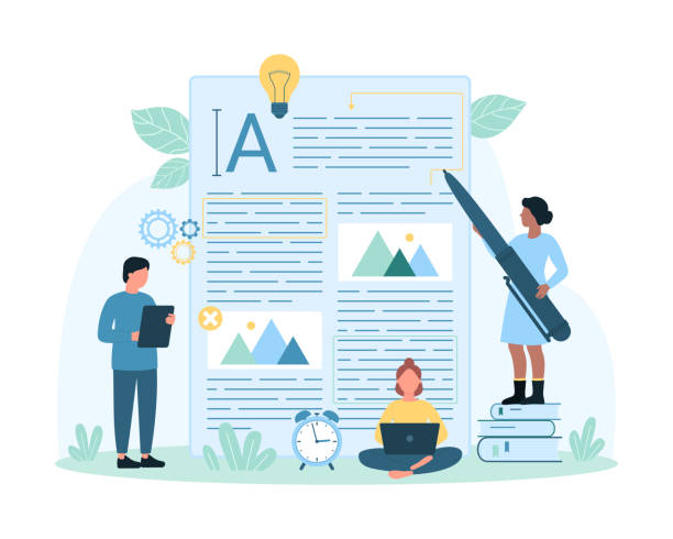
When web pages are overloaded with information—whether it’s text, images, or links—users can quickly feel overwhelmed and leave. A clear, well-organized content hierarchy helps readers understand what’s important, guiding them smoothly through your website and keeping them engaged.
The Power of a Clean Structure
Without a logical structure, visitors struggle to follow your content, especially if there’s no clear visual flow. Using a consistent layout and organizing your pages with headers, subheaders, and whitespace can make even complex information easy to absorb.
How to Do It: Use an “F-layout” design pattern, with important content like CTAs positioned along the top and left, following users’ natural reading habits. Break up long paragraphs, group related content into sections, and use bullet points for readability.
Strategic Calls-to-Action (CTAs) for User Guidance
CTAs serve as navigational markers that help users progress through your site, whether by signing up, learning more, or making a purchase. When CTAs are placed at key points in a logical content flow, they feel more intuitive and natural, rather than disruptive.
How to Do It: Integrate CTAs within content sections, making them clearly visible with contrasting colors. Rather than random placement, use CTAs as guides that direct users toward specific actions without overwhelming them.
Reduce Clutter for Higher Engagement
A cluttered page full of visuals, text, and links can create cognitive overload, causing users to lose focus. Clean design with a defined hierarchy prioritizes key elements and reduces distractions, which leads to a better experience and greater engagement.
How to Do It: Eliminate unnecessary elements and use reusable blocks like testimonials or feature summaries. This keeps layouts consistent across pages, which helps users know where to find important information.
Building a Logical Content Flow to Support User Journeys
Think about the path a visitor might take through your site and align your content hierarchy to support these journeys. For example, start with an overview of your service, then follow up with benefits, testimonials, and a clear CTA.
How to Do It: Organize pages with a logical structure that reflects common user journeys. Place related sections in sequence, guiding users from general information to specifics, and ultimately toward a conversion.
Emphasizing Visual Hierarchy for Clear Navigation
Visual hierarchy uses size, color, and placement to direct attention to what’s most important. This approach makes it easy for users to skim and still capture essential information, like key features or CTAs.
How to Do It: Make headings, subheadings, and CTAs prominent. Use larger fonts, contrasting colors, and whitespace to naturally draw attention to these elements, ensuring users focus on what matters.

7. Slow Page Loading Times: Why Speed Matters for User Experience and SEO
A slow website frustrates users and can severely impact your SEO. Page loading speed is a critical factor for Google rankings, and delays can lead to higher bounce rates, with users leaving before the page even loads fully. Ensuring your site loads quickly is essential for keeping visitors engaged and improving visibility in search results.
Reducing Large File Sizes and Compressing Components
Large file sizes, such as high-resolution images and uncompressed files, are common culprits behind slow loading times. Compressing these elements helps reduce load times and improve user experience.
How to Do It: Use file compression techniques and tools to reduce image and video sizes without sacrificing quality. For example, compress images before uploading and limit file sizes to what’s necessary for clear visuals.
Implementing Lazy Loading to Prioritize Content
Lazy loading defers the loading of images and videos until they’re needed, reducing initial load times by prioritizing only above-the-fold content. This can significantly improve the speed of your site, especially on pages with multiple media elements.
How to Do It: Enable lazy loading for images, videos, and other media. Many content management systems (CMS) and plugins support lazy loading, so you can activate this feature to improve load times and minimize bounce rates.
Optimizing Outdated Code for Faster Performance
Outdated code and unused scripts can slow down your site, as browsers have to process more information. Removing unnecessary code improves page loading speed and makes your website easier to maintain.
How to Do It: Review your site’s code for outdated or unused elements, and streamline it where possible. For instance, eliminate unnecessary JavaScript or CSS files, and ensure your code is compatible with modern web standards.
Using Browser Caching to Improve Load Times
Browser caching saves certain site components on a visitor’s device, so they don’t need to be reloaded each time the user returns. This helps returning visitors experience faster load times and reduces the overall server load.
How to Do It: Enable browser caching to store images, CSS, and JavaScript files locally. This allows repeat visitors to load pages faster, as these files don’t have to reload with each visit.
Compressing Components and Minimizing HTTP Requests
Each HTTP request adds to the time it takes to load a page. By compressing components and limiting the number of requests, you can streamline page loading and improve user experience.
How to Do It: Consolidate CSS and JavaScript files to reduce the number of HTTP requests. Compressing components, such as CSS and JavaScript files, makes pages load more efficiently. Use tools like Google PageSpeed Insights or GTMetrix to identify excessive requests and compress components as needed.
Managing Large Media Files for Optimal Speed
Large file sizes can drag down your site speed, especially if they’re not optimized. By managing and compressing large media files, you can significantly reduce load times without compromising on content quality.
How to Do It: Convert images to more efficient formats, such as WebP, and compress videos. This can reduce the overall file size while maintaining quality. Tools like TinyPNG for images and HandBrake for videos can help optimize large media files.

8. Inconsistent Branding Across Pages: Balancing User Experience and Aesthetics
Striking the right balance between user experience and aesthetics is essential for creating a website that is both visually appealing and functional. While an attractive design can draw users in, excessive or inconsistent design choices may hinder usability, causing confusion and impacting the overall user experience. The goal is to create a cohesive look that enhances interactions without overwhelming visitors.
Cross-Browser, Cross-Device, and Cross-Platform Consistency
A consistent design across browsers, devices, and platforms ensures a seamless experience for every user. Differences in layout or functionality across devices can create confusion and harm your brand’s credibility.
How to Do It: Test your website on multiple browsers (e.g., Chrome, Safari, Firefox) and devices (e.g., desktop, tablet, mobile) to confirm that each element appears and functions as intended. Ensuring cross-platform design consistency maintains brand integrity and enhances user experience by reducing discrepancies.
Prioritizing User Experience Over Excessive Animation
While animation can add visual appeal and guide users, excessive or unnecessary animations may slow down your site and distract users from important content. Keeping animations minimal and purposeful contributes to a smooth, accessible experience.
How to Do It: Use animation sparingly to draw attention to key areas, like CTAs or transitions, without overloading pages. Prioritize website speed by limiting animated elements that may impact load times, ensuring users can focus on content.
Adopting a Minimalist Style for Better Usability
A minimalist style reduces visual clutter, making navigation and content consumption easier for users. By focusing on simplicity, you allow important elements to stand out and create a streamlined, user-friendly design.
How to Do It: Embrace whitespace, use a limited color palette, and reduce unnecessary design elements. Minimalism keeps the design visually appealing while maintaining a clear focus on user experience, which helps users interact with your site efficiently.
Ensuring Cohesion with Consistent Tech Architecture
Tech architecture plays a critical role in aligning design with functionality. Using the same layout structure, fonts, and navigation system across your site helps create a unified experience that supports usability and makes navigation intuitive.
How to Do It: Develop a tech architecture plan that includes consistent CSS styles, grid layouts, and design components. Consistency in these elements helps users feel grounded, improving both user interactions and user experience.
Maintaining Visual Appeal without Compromising Speed
Aesthetics should never come at the expense of performance. Excessive graphics, animations, or complex layouts can slow down load times, negatively impacting both website speed and user experience. Faster sites lead to better engagement and a higher likelihood of retaining visitors.
How to Do It: Optimize images, minimize animations, and limit the use of resource-heavy elements. A visually appealing, fast-loading site enhances the overall user experience, ensuring that design choices do not compromise performance.

9. Overusing Pop-ups and Ads: Balancing Engagement with User Experience
Pop-ups and ads can be valuable tools for generating leads and driving conversions, but overusing them can disrupt the user experience and lead to high bounce rates. When visitors encounter too many pop-ups, autoplay ads, or cluttered ad placements, it creates a frustrating experience that often drives them away. Striking a balance between engagement and usability is essential for maintaining a professional and user-friendly site.
Timing Pop-Ups to Reduce User Frustration
Timing is key to making pop-ups feel less intrusive. Displaying a pop-up immediately upon page load can overwhelm users before they even start browsing, leading to quick exits. Timed pop-ups—those that appear after a user has spent time on the page—feel less disruptive and increase the chance of engagement.
How to Do It: Use timed pop-ups that appear after a user has spent at least 30 seconds on the page or scrolled halfway down. This approach respects the user’s browsing flow and offers information when they’re already engaged with your content.
Implementing Exit-Intent Pop-Ups for Better Engagement
Exit-intent pop-ups appear when a user is about to leave the page, capturing attention at a critical moment. These pop-ups can be useful for offering last-minute incentives, such as discounts or newsletters, without disrupting the initial browsing experience.
How to Do It: Configure exit-intent pop-ups to trigger when a user moves their cursor towards the browser’s close button. This method targets users who are about to leave, allowing you to engage them without interrupting their experience on the page.
Avoiding Autoplay Ads for a Pleasant User Experience
Autoplay ads, especially those with sound, can be highly intrusive. They not only disrupt the browsing experience but can also slow down page load times, impacting overall site performance and SEO.
How to Do It: Disable autoplay settings for ads and videos, and give users the option to start playback if they’re interested. This enhances user experience by reducing unwanted distractions and respecting user control over their browsing.
Limiting Ad Placement to Reduce Clutter
Ads that are placed throughout the page can make a website look cluttered and unprofessional. Strategic ad placement improves usability by ensuring that ads don’t interfere with the main content or overwhelm the page layout.
How to Do It: Place ads in designated, non-intrusive areas like sidebars or footers. Avoid embedding ads within the main content flow, as this can disrupt readability and detract from the user experience.
Optimizing Pop-Ups for Mobile Devices
Pop-ups that aren’t optimized for mobile can obstruct the entire screen, making it difficult for users to close them or continue browsing. This is especially frustrating on smaller devices and can lead to high bounce rates.
How to Do It: For mobile users, use smaller pop-ups that are easily dismissible with a tap. Ensure that the close button is clearly visible and accessible. This mobile-friendly approach respects the limitations of smaller screens and improves usability.
Using Personalized and Relevant Pop-Ups
Personalized pop-ups based on user behavior or demographics can be more engaging and less disruptive. By tailoring content to user preferences or browsing history, you increase the relevance and effectiveness of pop-ups.
How to Do It: Use targeting options to show pop-ups based on user interactions, such as pages viewed or time spent on the site. For example, a returning visitor might see a personalized offer, making the pop-up more relevant and enhancing the likelihood of conversion.

10. Auto-Playing Videos and Sounds: Respecting User Control for a Better Experience
Auto-playing videos and sounds can be jarring, particularly for users who aren’t expecting them or are browsing in a quiet environment. While media can add value to a website, auto-playing content without user consent is often seen as intrusive and can lead to a higher bounce rate. Allowing users to control multimedia playback creates a smoother experience and reduces frustration, ultimately keeping visitors on your site longer.
Giving Users Control Over Playback
User control is essential for a positive experience with media content. When users have the option to start or stop videos and audio, they’re more likely to engage positively with the content.
How to Do It: Disable auto-play for all multimedia content and provide a visible play button. Allow users to control volume or mute sound by default, so they can engage with content when it’s convenient for them.
Positioning Media Strategically for Maximum Value
Multimedia, such as videos and audio, should add genuine value to the user experience and be placed where they can enhance understanding or engagement. Strategic media placement ensures that content like product demos, testimonials, or tutorials is accessible but not disruptive.
How to Do It: Embed videos in relevant sections, such as product pages or informational content, and ensure they’re positioned naturally within the layout. This approach respects the user’s journey through your site while keeping valuable media content accessible.
Reducing Bounce Rates with Opt-In Video and Audio
Opt-in media allows users to decide when they want to engage, preventing surprise playback that could cause them to leave the site immediately. Giving users the choice to interact with media reduces bounce rates by making the experience feel more personalized and less invasive.
How to Do It: Offer interactive media elements, such as thumbnail previews for videos, and add a clear play button for user initiation. This lets users explore content at their own pace, creating a more customized browsing experience.
Maintaining Website Performance by Avoiding Heavy Media Files
Auto-playing videos can strain website performance, increasing load times and potentially affecting SEO. Large media files, especially if they play automatically, can slow down your site, impacting both user experience and search rankings.
How to Do It: Optimize videos by compressing files and choosing efficient formats, such as MP4 for video and MP3 for audio. Use lazy loading to defer media loading until the user scrolls to the section, improving page loading speed without sacrificing content.
Balancing Engagement with Minimalist Media Usage
While multimedia can boost engagement, overuse can lead to visual clutter and overwhelm users. A minimalist approach to media usage ensures that videos and audio are used thoughtfully, enhancing rather than detracting from the website experience.
How to Do It: Limit multimedia to key areas where it adds value, such as testimonials or product demos, rather than embedding it throughout the page. A selective approach keeps the focus on content that enhances the user journey without causing distractions.
Wapping Up the 10 Biggest Website Design Mistakes
Avoiding these common website design mistakes is crucial to building a site that looks great and performs effectively for your business. By prioritizing user experience, optimizing for speed, ensuring accessibility, and maintaining consistent branding, you create a website that resonates with visitors and encourages them to take action. Thoughtful, strategic design can make a lasting impact, driving user engagement and building trust in your brand.
If you’re ready to dive deeper into these strategies, download our free guide on the 10 most common website design mistakes. This comprehensive resource will help you pinpoint areas for improvement and transform your website into a high-converting, user-friendly platform that supports your business growth.
